
.svg)
.svg)
.svg)
What makes email preheader text work?
Email preheader text works when it complements the subject line instead of repeating it, adding missing context, detail, or a next step that makes the inbox decision easier. The strongest preheaders front-load the main message, stay specific over clever, and match the tone to the email’s purpose.
What Email Preheader Text Does and How to Add Preheader Text in Your ESP
Preheader text is the short message preview a reader sees beside or below the subject line in the inbox before opening an email. That makes an email preheader part of the open decision, not a leftover copy. In practice, marketers usually add preheader text in the same place they manage sending details inside email service providers, so the email preview text is set before the message reaches the recipient's inbox. A vague subject line can become clearer fast when the preheader text adds the missing benefit, next-step, or context.
- Think of the Subject Line and Preheader Text as One Message Preview: the subject line earns attention, and the preview text adds useful detail.
- Keep the email preheader text separate from the body message so the inbox shows intentional preview copy instead of accidental preview text.
- When teams add preheader text early, the email preheader has a better chance of showing a clean preview in the recipient's inbox.
Why the Subject Line and Preheader Need to Work as a Pair
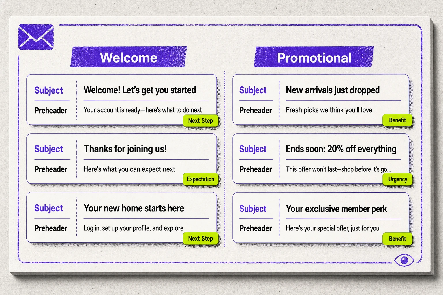
Readers do not judge an email subject line in isolation. They scan both the subject line and preheader as a single first impression, which means each line needs a different job. A strong subject line creates interest or tension. The preheader adds more context, more detail, or a clear direction so the message feels complete.
Repetition wastes valuable space. When both the subject line and preheader use the same text, the preheader stops helping and turns into a second subject line. Better pairs move the reader one step forward: the email subject line opens the loop, and the preheader resolves it with the next useful point.
Rule of thumb: a subject and preheader pair should complement rather than repeat each other.
Preheader Character Limit and Best Practices That Keep Formatting Clear
Preheader writing gets better when clarity beats cleverness. There is no single safe character limit because visible preheader space changes with device, platform, preheader length, font size, line height, and layout. The practical move is to treat the first few words as the part most likely to survive, then write the rest only if it still helps. These email preheader best practices protect the visible preheader before you spend extra space on tone.
- Front-load the main message so the first few words still make sense when the preheader text is cut short.
- Avoid repeating the subject line; use the preheader text to add a missing detail, not to restate the example above in slightly different words.
- Keep writing preheader text lean enough that more space feels optional, not necessary, because preheader displays can change.
- Use formatting sparingly. Extra space, decorative symbols, or crowded copy can make the character limit work against clarity instead of helping it.
How Truncation, Preview Text, and Alt Text Change What Readers See
Inbox preview space is unstable, and that is exactly why front-loading matters. Across web email clients, desktop clients, mobile email clients, and most mobile devices, the preview pane may show only the first few words of the intended preview text. If the main message arrives late, truncation can cut the useful part and leave a weaker preview.
- When teams do not control preview text cleanly, email clients pull the first line or first few lines from the actual email, including email's body copy that was never meant to sell the open.
- Image alt text can also surface in the preview the same way, which means a descriptive label may compete with the message before the reader sees the email content itself.
- Different devices and many desktop clients show preview space differently, so the safest habit is to place the main message in the first few words and treat the rest as optional preview support.
That is the working constraint for every example that follows: write the preview first, then write the tail.
Welcome Email Preheader Examples That Set Expectations and Drive Opens
Welcome emails are where the pairing rule becomes easiest to see. The subject line confirms the moment, and the email preheader adds the missing human cue: what kind of message this is, what value is inside, or what happens next. That is why strong email preheader examples in onboarding feel calm and specific rather than clever for their own sake.
| Angle | Subject line | Preheader | Trigger |
|---|---|---|---|
| Warm welcome | You're in. Welcome aboard | Your signup worked, and your first note starts here | Reassurance plus immediate clarity |
| Benefit-led | Welcome, here's what you signed up for | The 3 templates inside will save setup time this week | Concrete payoff |
| Next-step | Welcome, let's get you set up | Start with your profile so the next email fits you better | Forward motion |
Warm Welcome Pairs That Set Expectations Fast
A warm welcome works when the preview line sounds human but still carries useful information. Generic greetings waste the preview. Better welcome pairs confirm the signup and reduce that brief moment of uncertainty after someone hands over an email address.
- Subject Line: Welcome to the studio | Preheader: Glad you're here. Your weekly ideas start on Tuesday. | Why it works: The tone is warm, and the expectation is concrete.
- Subject Line: You're on the list | Preheader: We saved your spot, and the first issue lands tomorrow. | Why it works: It reassures the reader and gives the preview a time anchor.
- Subject Line: Thanks for joining us | Preheader: Expect practical notes, short reads, and no inbox clutter. | Why it works: Warmth is paired with a clear promise about the relationship.
Benefit-Led Welcome Pairs That Give a Reason to Open
Warmth opens the door, but value gives the click a job. In this pattern, the preheader names the payoff behind subscribing so the reader sees a compelling reason to open now instead of filing the message for later.
- Subject Line: Welcome, your starter kit is inside | Preheader: Begin with the checklist that cuts your first-hour setup time. | Why it works: The benefit is immediate and specific.
- Subject Line: Thanks for subscribing | Preheader: Your first three meal plans are ready to use tonight. | Why it works: The reward feels usable, not abstract.
- Subject Line: You're in. Start here | Preheader: Get the weekly framework members use to plan faster. | Why it works: It turns signup intent into a visible outcome.
Next-Step Welcome Pairs That Move the Reader Forward
The strongest welcome pairs do not stop at hello. They use the preheader to preview the first action, which makes onboarding feel lighter because the reader already knows what happens after the open. This works especially well in personalized emails, where the prompt reflects the step the subscriber just started. Teams can add personalization without overcomplicating the line.
- Subject Line: Welcome, let's build your first dashboard | Preheader: Add your data source first so your reports populate correctly. | Why it works: The next step is clear before the email opens.
- Subject Line: Your account is ready | Preheader: Choose your interests now, and we'll tailor the next send. | Why it works: The action is small, useful, and easy to preview.
- Subject Line: Start here | Preheader: Upload your first file to finish setup in under five minutes. | Why it works: It gives the reader a direct path into first use.
Promotional Email Preheader Examples That Support the Offer and Call to Action
Welcome pairs earned opens by reducing uncertainty. Promotional pairs earn it by making the offer more concrete. In email marketing, the strongest email preheader does not just echo the subject line. It adds timing, value, or a clearer call to action so the promotion feels specific inside a crowded email marketing campaign. Use these email preheader examples as templates, not factual offer terms.
| Trigger | Subject line | Preheader | Why it works |
|---|---|---|---|
| Urgency | 20% off ends tonight | Your code still works, but the window closes at midnight. | Promotional preheader text adds a real timing cue instead of repeating the discount. |
| Benefit | Better sleep starts this week | Breathable layers and a lighter feel, now at a lower price. | The email preheader extends the outcome the reader wants, not just the deal. |
| Action clarity | Your spring refresh is ready | Open the email to see the bundle, compare options, and choose your set. | The preheader text makes the next move obvious before the click. |
Discount-Driven Pairs That Create Urgency Without Sounding Desperate
Urgency works when the preheader gives the deadline a believable edge. If the subject line already carries the discount, the supporting line should add a reason to act now, not a louder version of the same pitch. That is what creates a sense of urgency without tipping into hype.
- Subject Line: Extra 25% off sale styles | Preheader: Prices drop through Friday, then this code expires.
- Subject Line: Last day for free shipping | Preheader: Order tonight if this week’s delivery timing matters.
- Subject Line: Weekend deal on bestsellers | Preheader: Popular sizes are moving first, so the best selection may not last.
Each pair stays credible because the pressure comes from a bounded condition: a date, a shipping cutoff, or narrowing selection. The preheader should sound like useful context, not a plea for attention.
Benefit-First Pairs for a More Focused Email Campaign
A focused email campaign does not always need a louder deal. Sometimes the stronger move is to let the subject line name the offer while the preheader expands the payoff. In practice, that makes the message read less like a sales letter and more like a useful reason to open.
- Subject Line: New member pricing ends soon | Preheader: Start with the planner that cuts weekly meal decisions in half.
- Subject Line: Save on your first order | Preheader: Build a simpler morning routine with the set customers reorder most.
- Subject Line: Limited-time bundle pricing | Preheader: Get the full desk setup in one box instead of piecing it together later.
That is the same job a Johnson box handles in direct mail. It stretches the promise just enough to make the click feel worthwhile. For a promotional email campaign, benefit-first promotion often wins by sharpening the outcome before the reader ever sees the body copy.
Clear CTA Pairs That Tell the Reader What Happens Next
Once the offer is clear, hesitation usually comes from uncertainty about the next move. CTA-led pairs fix that by telling the reader what opens, what they can review, or what decision they can make after the click. That clarity can convince readers faster than a clever line that hides the path.
- Subject Line: Build your bundle and save | Preheader: Open to pick your three items and see the discount update instantly.
- Subject Line: Your early-access styles are live | Preheader: Tap through to browse the drop before public release starts.
- Subject Line: Refresh your workspace for less | Preheader: See the full set, compare finishes, and choose the option that fits.
The best CTA-led promotional pairs remove friction before the body even loads. That matters even more in cart-abandonment emails, where the shopper already showed intent and the hesitation is more specific.
Cart Abandonment Email Preheader Examples That Bring Shoppers Back
Promotional campaigns cast a wide net. Cart recovery is narrower and more personal because the shopper already showed intent. That changes what the preview text needs to do. The subject line and preheader should respond to the stage of hesitation: first a reminder, then reassurance, then measured pressure. The best email preheader examples here feel timely, not copy-pasted urgency.
| Stage | What the pair needs to do | Example subject line | Example preheader |
|---|---|---|---|
| Reminder | Restore recognition and lower friction | Still thinking it over? | Your cart is waiting if you want to pick up where you left off. |
| Objection-handling | Answer the question blocking checkout | Questions before you check out? | See sizing, pricing, or return details before you decide. |
| Last-chance | Add a credible consequence without overplaying it | Last call to finish your order | If your brand uses a saved-cart deadline, complete checkout before it lapses tonight. |
Reminder Pairs That Bring the Cart Back Into View
Early cart emails work best when distraction is the problem. A friendly reminder does not need to invent urgency. It needs to make the unfinished choice easy to recognize again, with a subject line that signals the return and a preheader that restores just enough context to reopen the decision.
- Subject Line: You left something behind | Preheader: Pick up where you left off whenever you're ready.
- Subject Line: Your cart is still here | Preheader: The items you viewed are waiting in your cart.
- Subject Line: Forgot something? | Preheader: Take another look before the moment passes.
- Subject Line: A quick friendly reminder | Preheader: Your saved picks are ready when you want to come back.
Each pair keeps the ask light. The preheader does the extra work by turning a vague prompt into a recognizable moment, which is why this stage should stay softer than a broad promotional subject line.
Objection-Handling Pairs That Reduce Hesitation
When the first reminder does not bring the shopper back, the issue is often friction rather than forgetfulness. This is where the preview should answer the specific doubt that stalled checkout. The pair still needs to sound calm, but now it should reduce risk, not just restore memory.
When the first reminder does not bring the shopper back, the issue is often friction rather than forgetfulness.
- Price Hesitation: Subject line: Still deciding? | Preheader: Take another look at the value before you check out.
- Shipping Hesitation: Subject line: Questions before you order? | Preheader: Review delivery details and timing before you finish checkout.
- Fit Hesitation: Subject line: Need help choosing the right fit? | Preheader: Check the sizing guidance before you place your order.
- Returns Hesitation: Subject line: Want a little more confidence? | Preheader: See the return process before you make the final call.
The pattern matters more than the wording. Match the preheader to the actual blocker. Price needs justification, fit needs clarity, and returns concerns need reassurance. A generic reminder can miss all of that.
Last-Chance Pairs That Add Pressure Without Overdoing It
Pressure belongs late in the sequence, not at the start. By this point, the shopper has already seen a reminder and a reassurance angle. Now the pair can name a deadline or consequence, but only if it still sounds credible.
Now the pair can name a deadline or consequence, but only if it still sounds credible.
- Subject Line: Last chance to complete your order | Preheader: If your brand uses a saved-cart cutoff, finish checkout before it ends tonight.
- Subject Line: Final reminder for your cart | Preheader: Complete your order soon if you still want these items.
- Subject Line: Your cart will clear soon | Preheader: Return now if you're ready to finish your purchase.
The warning here is simple: do not jump straight to alarm. If the consequence is in hypothetical template copy, keep it proportionate and specific. That tonal shift matters again in the next family, where the problem is no longer checkout hesitation but subscriber drift from the brand entirely.
Re-Engagement Email Preheader Examples That Win Back Inactive Subscribers
Cart recovery asks for a resumed purchase. Re-engagement asks for a resumed relationship. That changes the job of the email preheader examples in this section: the line has to reopen attention without sounding needy, guilty, or oddly intense. The safest way to think about it is by motivation. Some inactive readers need a relevant spark; some need proof that the message is useful again, and some need a respectful decision point.
| Approach | What the pair does | Best fit | Tone boundary |
|---|---|---|---|
| Curiosity-led | Creates a relevant gap worth resolving | Light inactivity or fading attention | Intrigue should clarify the message, not hide it |
| Value-led | Proves the email is useful again | Subscribers who stopped seeing a reason to open | Lead with renewed relevance, not apology |
| Breakup-style | Forces a clear stay-or-go moment | Deeper inactivity after softer nudges | Use restraint so the decision feels respectful, not dramatic |
Curiosity-Led Pairs That Invite a Return
Curiosity works when the subscriber can feel the payoff before opening. Empty mystery gets ignored. A stronger pair uses preview text to hint at something specific enough to matter while still leaving people curious about the missing piece.
- Subject Line: Still interested in smarter weeknight dinners? | Preheader: Three 20-minute recipes rose to the top while you were away. Why it works: The preview gives a concrete reason to return without giving away everything.
- Subject Line: You missed a small update with big impact | Preheader: The new dashboard shortcut cuts the weekly check-in to one preview-screen. Why it works: The gap is functional, not vague, and the word preview helps promise substance.
- Subject Line: We saved one of our best reads for your comeback | Preheader: A little humorous preview text can work here, but the article itself still has to earn the click. Why it works: Humorous preview text softens the tone, yet the pair still points to a real payoff.
Value-Led Pairs That Give Inactive Readers a Fresh Reason to Care
When interest has cooled, usefulness has to return first. Value-led return pairs do not ask for another chance. They show that the email has become worth opening again because something new, practical, or timely is inside.
- Subject Line: A new template pack for your next campaign | Preheader: Use the five highest-clarity layouts without rebuilding from scratch. Why it works: The benefit is immediate and concrete.
- Subject Line: Your reporting shortcut is ready | Preheader: The updated guide shows what changed and what to check first. Why it works: The pair restores relevance by solving a current task.
- Subject Line: We made the newsletter more useful | Preheader: Expect one practical idea, one example, and less filler each week. Why it works: The preheader re-proves usefulness instead of apologizing for past sends.
Breakup-Style Pairs That Create a Decision Moment
This is the strongest re-engagement angle, and it needs the most judgment. Breakup-style pairs can work because they turn silence into a decision, but the tone has to stay calm. One send can feel decisive. Repeating the same move can feel manipulative fast.
- Subject Line: Should we stop sending these? | Preheader: Stay on the list if these updates still help, or step away with one click.
- Subject Line: Is this goodbye? | Preheader: We only want to keep showing up if the message still earns a place in your inbox.
- Subject Line: Last call to keep your weekly insights | Preheader: Confirm that you still want them before this series goes quiet.
The caution is simple: use breakup-style pairs late, sparingly, and without wounded language. Do not scold. Do not guilt the reader. Do not turn every dormant segment into a dramatic exit scene. Re-engagement pairs should create a choice, while newsletter emails need to prove they are worth opening before that choice is necessary.
Newsletter Preheader Examples That Keep Your Email Campaign Worth Opening
Re-engagement emails try to win back lost attention. A newsletter has a different job: stay visible in the inbox by giving readers a clear preview of what is most worth their time. In a recurring email campaign, freshness usually comes from selectivity, voice, or one strong angle, not from trying to mention everything at once.
| Pattern | Subject line | Preheader | Why it works |
|---|---|---|---|
| Roundup pairs | This week in content: the one shift teams should not miss | A short summary of the most useful change leads | Puts one must-read preview ahead of a crowded list of important points |
| Editor-led pairs | A quick note from the editor: the trend worth watching | Originally published takes the back seat; the preview shows why this angle matters now | Keeps personality visible without losing payoff in the inbox |
| Single-story pairs | The meeting habit that quietly breaks good ideas | A sneak peek at the tension inside the story | Builds curiosity around one narrative thread, not the whole newsletter |
Roundup Pairs That Preview the Most Valuable Read
Roundup newsletters fail when they read like a contents page. The better move is a selective preview that lets one strong item carry the open, because readers make a fast inbox decision on what feels most useful now.
- Subject: 3 ideas for a calmer Monday morning | Preheader: Start with the short summary on meeting debt before the other important points pull focus
- Subject: What our team read this week | Preheader: Preview the essay on customer interviews first, then let the roundup support it
- Subject: Friday briefing: what changed in creator pay | Preheader: The most valuable read breaks down the policy shift in plain language
- Subject: This week’s newsletter: strategy, hiring, and one sharp lesson | Preheader: Lead with the hiring mistake readers can fix today
Each pair treats the preheader like editorial triage. It names the item with the highest immediate value, gives that item the preview space, and lets the rest of the newsletter benefit from a stronger hook.
Editor-Led Pairs That Sound Personal Without Wasting Space
Personality helps a newsletter feel human, but it cannot do the whole job. Editor-led pairs work when the voice opens the door and the preheader still gives the reader a reason to care.
- Subject: A note from Maya: the question I kept coming back to | Preheader: This issue breaks down why retention dipped even when traffic held steady
- Subject: From the editor: one conversation changed this week’s issue | Preheader: We pulled out the tactic founders used to cut onboarding friction
- Subject: Sunday letter: what felt different this week | Preheader: The payoff is a sharper read on where smaller teams are gaining leverage
- Subject: Quick editor’s note before you scroll | Preheader: Start with the chart that explains why referrals rose without more spend
The voice earns attention because it points somewhere. Voice with value keeps the send human and useful at the same time.
Single-Story Pairs That Build Curiosity Around One Main Idea
A single-story newsletter works best when the pair hints at tension, stakes, or an unresolved insight. Curiosity can earn the open, but only when the body copy delivers instead of turning the preheader into a vague tease.
- Subject: The founder who stopped answering after one bad launch | Preheader: A sneak peek at how silence changed the team more than the failure did
- Subject: Why one tiny policy created a trust problem | Preheader: The story starts with a simple rule and ends with a bigger cultural cost
- Subject: The best sentence in this week’s interview almost got cut | Preheader: Sneak peek, it changed the point of the piece once the editor slowed down
- Subject: A product lesson hidden inside a support ticket | Preheader: One overlooked complaint reveals the real gap in the onboarding story
These examples frame the reason to keep reading without spilling the whole plot. From here, the next shift is straightforward: transactional emails keep the pairing logic, but the reader intent changes from browsing for value to checking for status, reassurance, or a next step.
Transactional Email Preheader Examples That Stay Clear in Any Email Client
Newsletter previews can afford a little intrigue. Transactional messages cannot. In this part of the swipe file, the email preheader has a different job: help the reader recognize the update, gauge whether action is needed, and trust what appears in the email client at a glance. Strong email preheader examples for operational sends stay plain, specific, and useful beside the subject line.
| Use case | Subject line + preheader pattern | What the pair does |
|---|---|---|
| Order and shipping | Subject confirms the event; preheader adds timing, tracking, or delivery status | Orients the reader fast and reduces the need to hunt for the key detail |
| Account and security | Subject names the account event; preheader adds context, reassurance, or the next safe action | Signals seriousness without sounding alarming or promotional |
| Reminder and confirmation | Subject names the appointment, bill, or request; preheader adds the date, instruction, or next step | Turns preview space into guidance before the message is opened |
Order and Shipping Pairs That Confirm the Action Quickly
Order updates work when recognition is immediate. The subject line should name the event, and the preheader should carry the detail the reader actually wants first, such as timing, shipment status, or tracking availability. That keeps the message from sounding like a campaign and makes the open feel worth it.
- Subject Line: Your order is confirmed | Preheader: We’re getting it ready now and will email tracking soon.
- Subject Line: Your package has shipped | Preheader: Track delivery and see the current arrival window.
- Subject Line: Delivery scheduled for tomorrow | Preheader: Check the address and expected drop-off time before 8 p.m.
- Subject Line: Pickup order is ready | Preheader: Bring your confirmation code when you arrive.
Each pair lets the preheader finish the subject line rather than repeat it. In a crowded inbox, that extra detail is what makes a transactional subject line feel complete instead of abrupt.
Account and Security Pairs That Sound Reassuring, Not Promotional
Security-related emails carry more emotional weight, so vague urgency is a mistake. The inbox line should state what happened in calm, operational language, then give the reader a clear path to verify or respond. Reassurance comes from specificity, not softness.
- Subject Line: New sign-in to your account | Preheader: Review the device and location details if this was not you.
- Subject Line: Your password was changed | Preheader: If you made this update, no action is needed.
- Subject Line: Verify your email address | Preheader: Confirm this message to finish setting up your account.
- Subject Line: Security code requested | Preheader: Use this code to continue your sign-in securely.
Notice the tone. None of these lines sound casual, but none of them escalate the reader’s fear either. A strong account alert names the event, explains the next action, and helps the message feel trustworthy the moment it appears in the inbox.
Reminder and Confirmation Pairs With a Useful Next Step
Reminder emails become more useful when the preview answers the next practical question before the open. A date, time, document, link, or instruction can all belong in the preheader when they reduce friction and help the reader act faster.
- Subject Line: Your appointment is tomorrow | Preheader: Confirm the 2 p.m. time or reschedule before noon.
- Subject Line: Payment received | Preheader: Save your receipt and review the invoice in your account.
- Subject Line: Complete your registration | Preheader: Finish the last step to confirm your spot for Friday.
- Subject Line: Document ready for signature | Preheader: Open the preview and sign before the request expires.
That is the pattern to keep. When a reminder or confirmation pair includes the needed next step inside the preview, the message does more than announce itself. It starts helping before the open. That is the rule the final takeaways can now generalize.
How Preheaders Shape Email Open Rates and What to Apply From These Examples
After the swipe file, the larger pattern is clear: the strongest pairs make the inbox decision easier. A subject line earns attention, then the preheader adds missing context, sharpens relevance, or lowers uncertainty. That can support email open rates because the reader sees a clearer reason to care before opening. In email marketing, that same clarity can also improve click through rates later, since compelling preheaders set an expectation the message is ready to meet. The point is not cleverness. It is a cleaner decision in the inbox, supported by behavioral data in the broad sense of how people scan, compare, and choose.
- Make the pair complementary, not repetitive. The subject line should open the loop, and the preheader should complete it.
- Front-load the meaning. Put the offer, benefit, next step, or reassurance early, where truncation is less likely to hide it.
- Match tone to intent. Welcome emails can feel warm, but transactional emails need speed and trust first.
- Keep specificity over cleverness. Concrete value usually travels better than vague intrigue.
- Honor the preview promise. If the email body or landing page cannot deliver what the inbox preview suggests, the pair may win the open and lose trust.
A Short Checklist for Adapting Any Example to Your Campaign
Borrowing a pattern is easy. Making it fit a live campaign takes judgment. Before you write or send, run the pair through this adaptation checklist so the example still makes sense in a crowded inbox.
- Start with the campaign goal. Write the subject line and preheader for the actual action, audience state, and offer, rather than copying an example word for word.
- Trim the preview early. Put the most important words first so the pair still works when preview text gets cut off.
- Read the pair on its own. In the inbox, it should make sense before the reader sees the email body.
- Test in multiple clients and devices. Confirm spacing, truncation, and preview behavior before the send goes live.
- Check fallback and alt text risk. Hidden defaults, image-first layouts, or stray utility copy can replace the line you meant to show.
- Match the inside experience to the promise. The body copy or landing destination should deliver the same value, tone, and next step the preview suggested.
- Make one clear revision pass. Cut repetition, soften anything that feels overstated, and keep only what helps the reader decide to open.