.webp)

.svg)
.svg)
.svg)
In this blog, I had you let you know that I have discovered new landing page trends that have the potential to bring customers and leads through to your sales funnel.
But first, what is the value of the landing page.
A landing page is much more than just a place to get information about a product or service. It's the secret weapon your company needs to master to strike fear into the hearts of your clients and compel them to buy from you.
A landing page is the culmination of your brand's development and your entire business, and it must be visually appealing while also striking the right tone.
Here is your one-stop-shop for landing page trends for 2025. But first, let's go over some fundamentals.
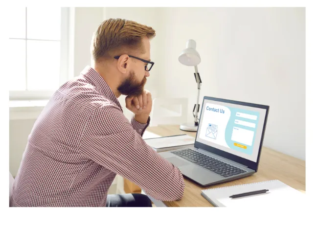
What Is a Landing Page?
Simply put, a landing page is a webpage that any customer can "land" on. It is a standalone page in the context of marketing and typically serves a single purpose. It is regarded as the next step for a prospect, to convert a visitor.
A landing page is a type of "click-through" that leads to another page, such as your website. It could also be based on lead generation.
The website homepage, click-through landing page, sales page, squeeze page, slash page, and viral landing page are all examples of landing page categories.
A landing page is any web page that serves as a "door" to your website, and you must use them effectively by combining a variety of techniques. A good landing page combines clear goals, compelling visuals, and user-friendly navigation to ensure higher engagement.
A static landing page is a simple, fixed webpage that provides essential information without interactive elements. Static landing pages are ideal for straightforward campaigns that don't require frequent updates.
Landing Page Trends For 2025
Staying updated with web design trends ensures your landing page remains fresh and engaging for users.
1. Interactive Elements
Interactive elements grab attention. Features like quizzes, sliders, and live chat let users feel involved.
For example, a quiz can help visitors find the right product for their needs. These tools not only make your page fun but also help gather important data about potential customers.
Did you know interactive pages often see a 30% increase in engagement? It’s a win-win for both users and businesses.
2. Micro-Animations
Micro-animations are tiny movements that bring life to a page. Think of buttons that glow when you hover or icons that shake slightly.
These details guide users and make the page easier to navigate. They also make your site look modern. Studies show that 60% of users find micro-animations visually appealing. Adding them keeps users on your page longer and helps explain your content in a subtle way.
3. Dark Mode Compatibility
Dark mode is now a must-have. It reduces eye strain, especially for mobile users. It also saves battery life and gives your page a sleek, professional look. Many top websites already offer this feature.
Dark mode is especially useful for pages with bold typography and minimal designs. Make sure your text and visuals remain clear in both light and dark modes.
4. Minimalist Design with Ample White Space
In 2025, less is more on landing pages! Imagine a clean, open space on a page that helps you focus on what's important.
This style uses lots of empty space, known as "white space," to make reading easier and to highlight important stuff like sign-up buttons or special offers.
This approach isn't just about looking good; it's about making the page simpler to use for everyone. A minimal landing page design reduces clutter and focuses attention on key actions.
5. AI-Powered Personalization
What if a landing page could know what you like, just like a friend? In 2025, this is possible with AI-powered personalization.
This technology uses information about what you usually like and do online to create a custom page just for you.
It's like walking into a room where everything has been set up perfectly to your taste, making it much more likely you'll click through or make a purchase.
6. Gamification
Everyone loves games, right? Gamification is when you turn something, like filling out a form on a landing page, into a fun game. This can be something like earning points for a quick quiz or spinning a wheel for a coupon code.
It makes interacting with the page fun and engaging, which can lead to better results, like more sign-ups or sales. This trend is all about adding play to the mix to keep you interested and active on the page.
7. Video Backgrounds
Video backgrounds are becoming a big trend in 2025. Instead of a plain picture, landing pages now use short videos that play automatically in the background.
These videos grab your attention quickly and make the page feel alive. For example, a travel website might show scenic views, helping visitors imagine their next vacation.
This approach keeps people on the page longer and encourages them to explore further. But keep in mind, videos need to load fast so they don’t slow down the page.
8. Voice Search Optimization
Many people now use voice assistants like Alexa or Siri to search for things. In 2025, landing pages are being designed to work well with voice searches. This means using simple phrases and natural-sounding keywords.
For example, instead of "purchase footwear," a page might use "buy shoes online." This trend helps your page appear when someone asks their voice assistant a question, bringing in more visitors without extra effort.
9. Social Proof Integration
Social proof is when you show visitors that others trust your product or service. For example, a landing page might highlight customer reviews, testimonials, or the number of people who have already signed up.
A fitness app could show “Over 1,000,000 users transformed their health!” This makes people feel confident about trying the service because they see proof that it works for others.
10. Sticky Navigation Bars
A sticky navigation bar stays at the top of the page even when you scroll down. This makes it easy to move to different parts of the website without going back to the top.
For example, if you're shopping for clothes, you can quickly click "New Arrivals" or "Sale" from anywhere on the page. Sticky bars save time and make the page user-friendly, which keeps visitors happy.
11. Split-Screen Layouts
Split-screen layouts divide the page into two sections, often with different purposes. For instance, one side could show an image or video, while the other side provides text or buttons.
This design grabs attention and works well for pages that need to show multiple options, like choosing between two products or services. It's visually appealing and makes the content easier to understand.
12. Dynamic Scrolling
Dynamic scrolling adds movement to the page as you scroll. For example, images or text might fade in, move, or change colors. This trend keeps visitors engaged and makes the page look modern.
It also helps tell a story, guiding users through the content step by step. But it’s important to keep it smooth so it doesn’t slow the page or confuse visitors.
13. Bold Gradients and Vibrant Colors
Bold gradients and vibrant colors are making landing pages more exciting in 2025. These designs use bright and blended shades to grab attention and create a modern look.
For example, a tech company might use a gradient of purple and blue to highlight a "Sign Up" button, making it stand out.
Using vibrant colors can also guide your visitors' eyes to important parts of the page, like a call-to-action or headline. These bold designs work especially well for industries like fashion, tech, and gaming, where creativity matters most.
Make sure the colors match your brand and are easy to read. A clean design paired with bold gradients can make your landing page visually appealing and memorable.
Bold typography draws attention to headlines and makes important messages stand out. Web design plays a crucial role in ensuring your landing page looks modern and aligns with your brand.
14. A More Visible Call-To-Action
A Call To Action is the part of your advertisement that instructs your audience on what they should do after clicking on your ad. The most basic example would be "click here right now!"
The more information you can provide your customers with through your CTA, the better. The intention is to empower your customer by imploring visitors to take action, converting them from a visitor to a customer.
It is now common in all forms of advertising, owing to the fact that a CTA is an excellent way to conclude any type of promotion.
They can be found at the bottom of a blog post or at the end of a YouTube video, where the presenter asks viewers to like and subscribe.
A CTA is a great way to end a landing page, but putting a block of text at the end of a long piece of copy is boring and uninspiring.
Using design and making your CTA eye-catching will make it stand out instead of blending it into the webpage. You can make it stand out by including some of the following elements:
They are typically found at the bottom of a blog post or at the end of a YouTube video, where the presenter requests that viewers like and subscribe.
A CTA is an excellent way to conclude a landing page, but putting a block of text at the end of a long piece of copy is dull and uninspiring.
Using design and making your CTA eye-catching will help it stand out rather than blend in with the rest of the page. Include some of the following elements to make it stand out:
Make the CTA correspond to the ad or link. Customers who are served with an ad or click on a backlink will have a higher conversion rate because they have a strong intent match.
Using copy that corresponds to the ad or marketing material ensures that users know they are in the right place, and this consistency of message evokes feelings of trust, which is critical in a cold audience.
Create a separate mobile landing page that matches the website's speed. It is critical to ensure a fast website because users are likely to click away.
One in every four visitors will abandon a website that takes more than four seconds to load.
In addition, a one-second delay in your website loading reduces customer satisfaction by 16%. It is critical to ensure that your page load times are low and that your website is mobile-friendly.
15. Organic Intent
Increasing organic intent requires a combination of factors, not just one. Search Engine Optimization is critical, and how your webpage is optimized has a significant impact on how it ranks.
On-page SEO refers to the general practice of optimizing a single webpage in order to generate more relevant traffic and rank higher. On-page refers to both the HTML source code and the content of a webpage.
How do you improve your on-page SEO?
Investigate the competition.
Consider your competitors when creating an SEO-friendly landing page. It is critical to generate the right traffic, and determining your keywords is an important practice that ensures you rank for the relevant topics.
However, looking at your competitors and the keywords they use is one way to cut this time in half.
Remember that staying true to your core idea is more important than copying approaches that are undetected by other landing pages.
If you become distracted by keywords and pepper your website with variations of long-tail keywords that will rank, you will move up the search engine results page, but you will invariably target searches that do not want your product.
16. Avoid using long blocks of text.
While we often hear that search engines prefer long content over short content, this can contradict our beliefs about creating great landing pages.
The importance of well-researched content is important for ranking, but using small amounts of text will still produce good results in search engine rankings, as long as the webpage has enough backlinks.
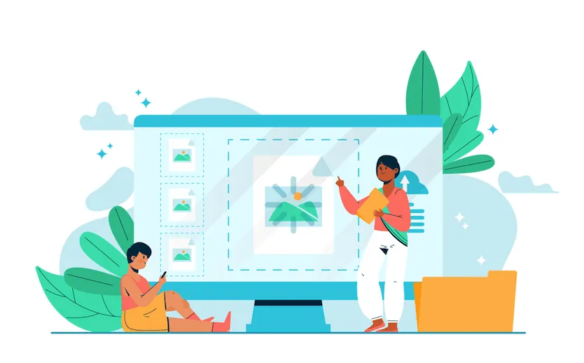
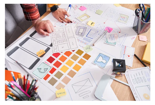
17. Custom illustrations
You can add animations and use illustration software to add dimension to a landing page to make it more visually appealing.
These illustrations should be consistent with your existing design system and can be used on social media content, e-commerce packaging, letterheads, and business cards.
Incorporating a design concept with a clear visual hierarchy is not only visually appealing but can also increase customer engagement.
Add to this the fact that interaction is a key component in enticing customers to click on your landing page. The better the analytics, the higher the likelihood of scoring leads.
Having more analytics allows you to gain a better understanding of your customer and their specific intent.
For example, you can learn more about a customer by looking at the number of hover events, the number of people who click on a specific product, and the length of time they watch a video.
Content engagement is critical for retargeting and remarketing. People are more likely to convert if they have interacted with your products.
Consider using personalized images on your landing pages; according to one study, using personalized images around a website's CTA more than doubled conversions.
18. Retro Themes
Incorporating themes from the past is another way to make your website look professional while also standing out.
Call it "retro" or "vintage," but for eye-catching visuals, you can incorporate different typographic styles to alter brand perception.
Headings with old-school typography can make for eye-catching contrast, especially if you use new fonts for the main body of the text.
To give your content a vintage look, draw inspiration from classic typography fonts like Baskerville, Rockwell, and Futura.
You can also compare this to modern typefaces like Dosis (which has a sci-fi quality) or Playfair Display, which is a very elegant typeface.
Off-white textures and colors can also be used. Paper-like sensations elevate the website's appearance beyond that of a digital storefront.
When it comes to harkening back to more retro approaches, using muted or dull colors that evoke the 1950s and 1960s advertising is a fantastic way to do something different while also triggering nostalgia.
There are numerous aspects of vintage advertising that capitalize on the power of nostalgia and memory, and your landing page can benefit from them.
Bringing back the old and combining it with the new can help you make the most of your landing page.
Oversized typography is another thing to think about. One of the most popular landing page trends right now is large typography.
Using large typefaces adds drama to a webpage and instantly grabs attention. And sending these messages in a "loud" manner with crisp graphics can instantly add that "wow factor."
Oversized custom typography is an extremely artistic setup, and its volume and style can substitute for actual illustrations.
It is a very simple way to replace animations and illustrations, particularly when a company does not have the budget to invest in a work of art.
19. Full Page Lightboxes And Email Invites
From Malevich's "Black Square" to David Bowie's "The Next Day," the simple square has been striking in popular art and culture for some time, and it is currently a very popular component of landing page designs.
It's a very familiar scene; a pop-up that appears in the center of our screen can be annoying, but lightbox pop-ups can be a fantastic way to notify users about promotions and collect customers' email addresses.
Let us not forget that automated email marketing is still an important component in driving traffic to your website.
Email is still the most important marketing strategy for acquiring new customers, even more so than social media.
And, because email marketing is a low-cost, customizable, and measurable component, using a full-page lightbox is an excellent way to capture the attention of potential customers while also utilizing this pillar of marketing tactics.
20. Flat Neomorphism And Depth
Neomorphism is a very popular landing page design trend right now. It combines the words "new" and "skeuomorphism," a modern iteration of what is known as "skeuomorphism."
In essence, it is a minimalist approach to designing a website with a soft, almost plastic appearance.
This visual style combines a soft extruded plastic look with subtle 3D styling, and it is a popular way to add depth to your website.
We must keep in mind that a well-designed landing page will elicit an emotional response from the customer. Motivating a customer to buy a product is based on some basic, yet critical, human emotions.
The wealth or status of the products, as well as providing peace of mind and pleasure to a customer, will translate to providing your customers with something meaningful.
How to Design a Landing Page

To create landing pages that convert, focus on simplicity, speed, and user engagement. Follow the below steps:
1. Set a Clear Goal
Every landing page should have one clear purpose. It could be getting users to sign up, buy a product, or download an ebook.
A clear goal helps focus the design and messaging. Visitors should know immediately what action to take. Confusing pages lose potential customers.
How to Implement:
- Start by deciding what you want users to do.
- Use a strong call to action like “Sign Up Now” or “Get Started.”
- Keep the page simple. Avoid unnecessary elements that distract visitors.
Using a landing page builder can save time and simplify the process of creating professional-looking pages.
2. Craft a Compelling Headline
The headline is the first thing visitors see. It should grab attention and explain your offer in a few words. Your landing page visitors should immediately understand the value of your product or service.
A good headline encourages visitors to stay on the page. Without it, they may leave within seconds.
How to Implement:
- Use action words like "Discover" or "Learn."
- Focus on the value your product or service provides.
- Keep it short and easy to understand. For example, "Save Time with Our Landing Page Builder."
3. Use Visual Hierarchy
Visual hierarchy means arranging elements on a landing page so viewers know where to look first. Important items, like headlines or buttons, should stand out.
It makes your landing page easier to read. People have short attention spans. If they can’t quickly find what they need, they’ll leave. A clear visual hierarchy keeps visitors engaged and helps them focus on your message.
How to Implement It:
- Use large, bold fonts for headlines. These grab attention immediately.
- Highlight call-to-action buttons with contrasting colors. For example, if your page is mostly blue, a bright orange button will stand out. Effective landing pages guide users to take action with clear calls-to-action and engaging designs.
- Organize information in chunks. Break content into sections with headings, so it’s easy to scan.
- Use white space to separate elements. It helps avoid clutter and makes your page visually appealing.
An effective landing page design incorporates responsive layouts, bold visuals, and a strong focus on user needs.
4. Keep the Layout Simple
A simple layout is clean and easy to navigate. It avoids unnecessary distractions, so visitors can focus on what’s important.
Complicated designs confuse visitors. They might not know where to click or what action to take. A simple layout improves the user experience and keeps them on the page longer.
How to Implement It:
- Limit the number of colors and fonts. Too many can look messy.
- Use a single column layout for easy scrolling. Most people browse on mobile devices, so a straightforward design works better.
- Reduce extra elements like pop-ups or animations that slow the page down.
5. Optimize for Speed and Mobile
A fast-loading and mobile-friendly landing page is essential. Most users visit websites from mobile devices, and slow pages make them leave quickly. If your page takes longer than three seconds to load, you risk losing potential customers.
Page speed and mobile optimization impact user experience and conversion rates. Search engines like Google also rank fast pages higher. A mobile-friendly design ensures your content looks good on any device, making it easy for visitors to navigate and take action.
How to implement:
- Compress images: Use tools to reduce image sizes without losing quality.
- Use fast hosting: Choose a reliable web hosting provider.
- Enable caching: This stores parts of your page so it loads faster for returning visitors.
- Use responsive design: Test how your landing page appears on smartphones and tablets.
- Remove unnecessary elements: Avoid heavy animations or large files that slow the page down.
Optimizing landing pages for mobile devices is essential, as most users browse on smartphones.
6. Include Social Proof
Social proof means showing that others trust your product or service. It can include customer testimonials, reviews, or statistics about how many people use your product.
People feel more confident when they see others have had a good experience. Adding social proof builds trust and helps persuade visitors to take action. For example, showing positive reviews can make users more likely to sign up or buy.
How to implement:
- Add testimonials: Include short quotes from happy customers.
- Show reviews: Use star ratings or excerpts from review platforms.
- Highlight numbers: Display how many people have used or loved your product.
- Use logos: If big companies or brands use your service, feature their logos.
- Include case studies: Share stories of customer success.
High converting landing pages focus on clear messaging, fast load times, and social proof integration.
Conversion Rates in Relation to Other Metrics
The conversion rate is calculated by dividing the number of conversions by the number of visitors. For example, if a website receives 1000 visitors in a month and 50 sales are made out of these 1000 visitors, the conversion rate is 5%.
Understanding the percentage of your users who buy your product will give you insight into how to move your website or business forward.
When compared to other metrics, it is critical to remember that conversion rates are not the be-all and end-all.
Other analytics metrics that we may need to incorporate to gain a better understanding include the following:
Average time spent on the page: This is the average amount of time users spend on your website. Sessions. This is the number of people who have visited your website.
Rates of entry and exit: They track not only the locations that provide access to your website, such as your homepage but also how many visitors leave your website from specific pages.
Time to Interactive (TTI): This measures the time a page takes before a user can interact.
Conclusion
The design of a landing page is not about one approach, whether it is about changing your approach to the layout of the webpage, making the most of SEO, or going back to basics.
It is a team effort that requires the designer to work hard to innovate, take risks, and keep an ear to the ground for current trends.